Monday, 28 March 2011
Possible Music downloaded to use within my media trailer
Above is a video I had made in windows movie maker, it contains snipets of the music i downloaded from website http://incompetech.com/m/c/royalty-free/. These sound files inspired me to create my short film trailer, although I did not use all of them I felt it would be a good idea to give examples of all in order to present the reasons why I used some and not others.
http://www.youtube.com/watch?v=R30IvsTdhXA
Thursday, 24 March 2011
Final Film Trailer Complete
Below is my final film trailer I created it in Windows Movie Maker.
I originally began to create the trailer in Adobe Flash player , however I could not continue constructing the final product as the program was constantly freezing. As a final resort I then switched to Movie Maker and started again from scratch. I actually found Movie Maker easy to use although the range of tools compared to adobe was very limited. Nevertheless I worked with what I had and I am pleased with the finished project.
Thursday, 17 March 2011
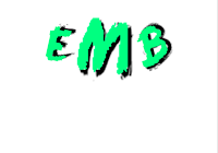
Plan and creation of my production company logo
I decided upon the name 'EMB Productions ', these are the initials of my name and considering Ive completed the trailer on my own I thought this was a good reason. It shows how I stand strong as an individual.
Because I dont have the tools to create an animation I decided on another way to enable my logo to move . This was to firstly create my logo and then pick it apart.


 I inserted around 30 pages on the microsoft publisher programme and within each screen each part of the production logo was presented. I then print-screened each word and pasted it into the programmee. I cropped each down to size so only the text and blank white background was visible. I then saved each image into an individual folder.
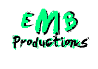
For the word "Prodcution" which was situated underneath "EMB" I wanted it to appear seperatly and move in motion differently to the singular letters above. My idea was for the same colour green used on the initials to pass quickly through the word. It would then appear as though the word had been illuminated.

The word appears as a whole and then we start to see glow of green pass through behind the lettering. To achieve this I had simply changed the colour of the word in paint and increased it's size slightly so it would stand out .
I proceeded to print screen the process of the green colouring running through behind the lettering and again saved images of this.


I then inserted these images into my trilaer as images and added an effect on to each , the effect enabled the image to move along quicker as it was a "Fast Forward" effect.
Tuesday, 15 March 2011
Questionnaire for film trailer
In order to gain useful feedback on an audiences views about my film trailer, I have decided to create a questionnaire which I will distribute just before I show my trailer to participants. I Will show two screenings of my film trailer. The first one will allow the audience to watch without having to think and the second showing will enable them to think more clearly about how they awnser each question. Below is the questionnaire I have created.


After the questionnaires have been completed I will take them in and come to an overal conclusion from the results. I'll then proceed to select a few of the participants that watched the screening and record them as they awsner the questions that were displayed on the questionnaire.
Friday, 4 March 2011

Title of my music magazine
I chose to name my film magazine “Fusion”. One definition for the word Fusion is; ‘a nuclear reaction in which nuclei combine to form more massive nuclei with the simultaneous release of energy ‘.
In relation to my film magazine I have used this word because just like a nuclear reaction, films can be explosive, exciting and both predictable and unpredictable. For example a film may be one nuclei that will combine with another nuclei, which could be represented as the media. Together they have the ability to create a ‘simultaneous release of energy’.
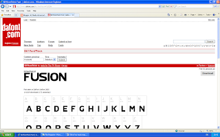
I felt the type of text I used to portray the title was important, it need to have a certain ‘spark’. http://www.dafont.com/ helped me create the perfect title for my film magazine, although firstly I played around with a range of texts that I thought might work. Below are the following texts I selected to experiment with.


I simply went onto the website and there I was presented with a range of headings in relation to the style of certain texts.


I then proceeded to click on the 'Various' link under the 'Techo' heading as I felt there would be a more diverse selection of texts to chose from.


Friday, 11 February 2011
Dead Runner Title
I decided that I wanted to show the title of my film at the ending of my trailer, as this builds suspense and creates fear and wonder within the audiences mind . The Name of my film is "Dead Runner", I have created a logo so that it will be recognized. Because I dont have the skills to use an animation programme i thought about how i could make the title move. I came up with the idea of making it grow in size, this gave off the thought that the "Dead Runner" was after the audience, as it grows in size it symbolizes its increase in power.
I achieved this by using the Microsoft Publication programme. I created a black background with a red border whilst the title was situtated in the centre. Each time i would increase the width of the red border and the size of the logo, I viewed each display in 'Print preivew' then printscreened each and saved them as pictures.


I achieved this by using the Microsoft Publication programme. I created a black background with a red border whilst the title was situtated in the centre. Each time i would increase the width of the red border and the size of the logo, I viewed each display in 'Print preivew' then printscreened each and saved them as pictures.


I next imported each image into windows movie maker and dragged them onto the timeline. I made sure the length between each image shown was short as this would produce more flow , rather than it being static and looking less like an animation.

Tuesday, 4 January 2011
Edited Image 3

This image is the one which I’ll be using for the front cover of my film magazine. After completing the stages of playing around with the makeup, costume and hair I placed my model against the wall in my hall, I thought the pattern of the wall paper appeared gothic which therefore fitted with the genre of my film. It sets the mood and atmosphere of the image as it creates a sense of enigma; it’s not very clear what the pattern actually is , this is connected to the facial expression my model has as viewers would not know why she looks so angry unless they watched the trailer. The wall paper is also a symbol for the vampire’s anger and confusion; I wanted it to appear almost as though it was her gloomy ora that surround’s her.
The shot I have taken here is a medium close-up as only her shoulders, chest and face can be seen, her costume consists of a very dark black long sleeved t-shirt with a lacy jacket layered over it , although this jacket can not be seen clearly in the image . The red scarf around her neck symbolizes prolepsis as she sucks others blood later on in the storyline.

The second image is the one which I have edited using the Photoshop programme. I firstly decided to adjust the brightness of the image in order for all the features to stand out more, such as the bright whiteness of the teeth, these are made to appear perfect although they are lethal and the most dangerous thing about this vampire girl. The blood red colour of the scarf around her neck symbolizes how she may take someone’s life by sucking the blood from a victim’s neck and she’s used the scarf as a way of covering up her own neck, which is ironic as she is not the victim. This again adds to the confusing and barbaric atmosphere.
The next thing I did was darkened the highlights, this way the colour black stood out. For example her top which makes gives the illusion of her popping out of the wall. Also the black makeup around her eyes which allows the blue colour of her eyes sparkle and appear inviting, this feature along with her teeth make her appear more innocent than she is.
Subscribe to:
Comments (Atom)