Tuesday, 14 December 2010

Edited Image 2

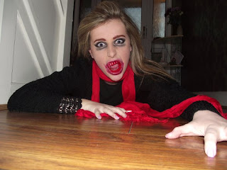
Below is the original image I had taken of the actress lying down on wooden floor, I didn’t necessarily want either the background or the floor to be part of the picture. Although I found the angle of the shot to be interesting and different, she has both her hands gripped to the floor as though she is desperate in need of something, in this case human blood. The expression on her face implies that she is frustrated and almost in pain because she needs the fix of blood so badly. As she her eyes peer into the camera it makes the audience feel tense and uneasy as they imagine her popping out of the page, the vampire is ready and rearing to pounce on her victim whom the viewer believes is them.


The following image is the one which I have edited using photo shop, as I mentioned previously I wasn’t happy with the background so decided to erase this out, I then used the lasso tool to crop around the outline of the head and shoulders . I wasn’t too concerned about the wooden floor she lay on as this was dark to begin with, by simply adjusting the brightness and shadows I was able to make it appear even darker. The models nails were originally painted a pale pink, although this did not fit with the characters persona, we didn’t have enough time to paint her nails black so used the paint brush tool to change the colour to black. Similar to the first image I edited I also increased the contrast as the shadowing and highlighting were decreased.
I also cropped the floor so less of it was visible, below is the image presented as a poster which I am in the process of completing.

Pictures for Ancillary Task


Monday, 13 December 2010

Edited Images


I've took images of my main actress for the ancillary tasks I need to complete, I plan to use the pictures for my poster. Because I took a lot of pictures I've experimented with more than one. The following pictures are the originals and those that have been adapted with the use of Photoshop.


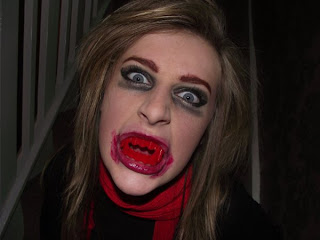
The image situated on the right is clearly edited. I achieved the look of the second image by using the tools available in photo-shop. I cropped the image firstly so I wouldn't have as much to cut out of the background. I didn't want the background as It was taken on stairs, although to achieve this shot I needed my model to sit down, in order to gain a slightly canted shot. I chose to shoot a canted shot because it allows the bloody teeth to be seen more clearly.

After using the lasso tool to erase the background , I was left with the single medium close-up shot. I decided to make the image brighter so the splashes of red would be more visible against the black. I then darkened the highlights so the black colouring looked more dramatic, lastly I changed the contrasting levels , this made the image appear a lot more sharper.

I transferred the picture into word processor as the programme allowed me to use the for formatting tools. I used the blur tool so the edges of the image would no longer be jagged, this made it look softer and neater.

Film Posters Conventions

Wednesday, 8 December 2010

Turn around Scare

Here are some shots I took earlier of the "Turn around Scare". This shot is commonly used within Horror films, hence why I have decided to use it in my short trailer. Overall I want this shot to symbolise how the vampire girl has just sucked a victims blood.


http://www.youtube.com/user/dancergal1909#p/u/2/MqMAOImsXcE
This First shot I took I decided to place my actress in front of a tree and directed her to stand still and whip her head around to face the camera on the count of three. The footage above is a bit shaky and resulted in y actress smirking towards the end of the shot.


http://www.youtube.com/user/dancergal1909#p/u/3/I__VUstQSMs
Becasue of this I re-shot the same action. Although this was a bit better it wasn't very focused on the zoom, as it looks as though I went off balance and resorted to zooming in on the side of her face rather than the middle.


http://www.youtube.com/user/dancergal1909#p/u/1/4m2h7sNDKOs
I found that the last shot I took was a lot more sucsessful as it was more positioned and the focus on the zoom was clearer, as it directly in the middle.

Monday, 6 December 2010

Film Magazine Questionnaire


In order to create a suscsessful film magazine cover I need some audience feedback, hence why i have put together a questionnaire , here are examples. I plan to print out questionnaires and distribute them around the school, I will then collect them back In and evaluate the results.

Preview Approved Certificate

At the start of any trailer or film a certain certificate is required to state how the production has been been approved, becasue this is an element that is  required ,i need to create something that will resemble a real one in order for my trailer to look more authentic.

Below is an example of real certifcate audiences would view at the very beggining of a film or trailer


Here is my attempt at creating something similar which i will use at the start of my short trailer when i add it in ,during the editing process.